Cardfree’s Order-Ahead system provides mobile and web ordering to SMB and large sized merchants. The unique demands of mobile ordering are met by the system which combines an existing, successful, production ordering code base with ground-up mobile-specific functionality, all encompassed within and making use of Cardfree’s integrated mobile commerce platform. Via the order ahead system, consumers may access a mobile/web menu, add items to their order, apply modifiers, choose a pick up location, pay for the order and finally check-in at the desired location to pick up their order.
ROLE | UX, UI DESIGNER |
---|---|
TOOLS | SKETCH, INVISION, HTML/CSS PROTOTYPING, ABSTRACT |
TEAM | MYSELF, PROJECT MANAGER, ENGINEERING TEAM, EXECUTIVE TEAM |
TARGET PLATFORMS | MOBILE (IOS,AOS), WEB |
A user with native mobile app or using the web app opens Order-Ahead services.
App asks for access to user location.
App checks user's location vs store address. User selects a store from list.
App access the store specific menu.
User is able to start an order, select pickup options or order type. The use is able to edit items from the order.
User is able to pay with credit card or store value cards.
Wait staff checks order, preps.
POS informs App order status e.g In Progress, Ready to Pick Up.
Users checks order status on device.
User picks up order at store.
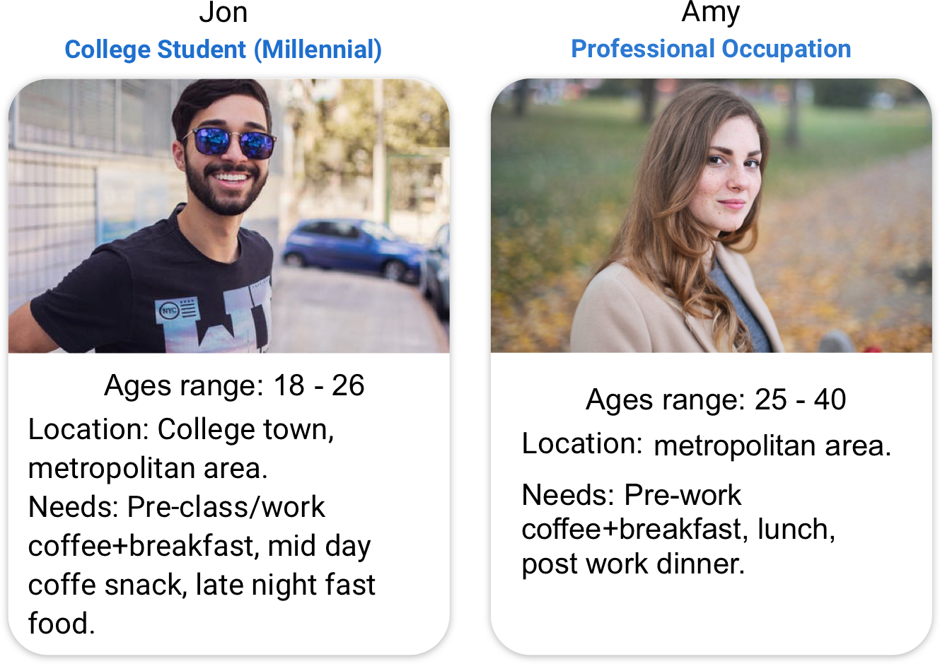
To begin my research on Order-Ahead in the mobile and web environments I started by looking at a few competitors with similar objectives, integrations and requierments. Through extensive testing and research I outlined the core features and fundamental principles these apps bring to the Order-Ahead ecosystem.
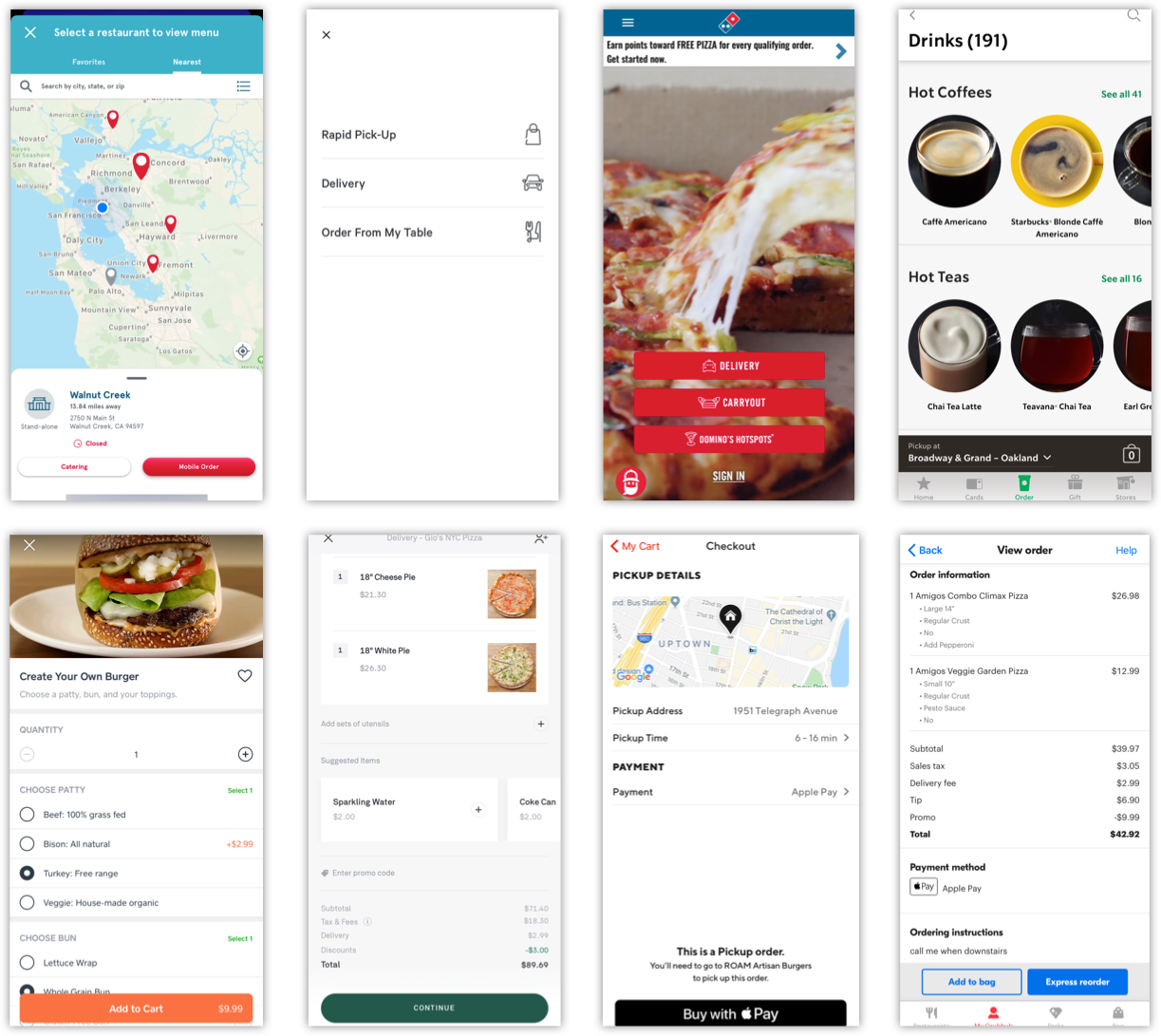
Screenshots taken for demostration purposes only, from left to right: Chick-fil-A, Panera Bread, Domino’s, Starbucks, Caviar, Postmates, DoorDash, Grubhub.
While the approaches in UI and Visual Design vary from merchant to merchant, the key and core features and UX are universal in the Order-Ahead ecosystem.
Some key findings:
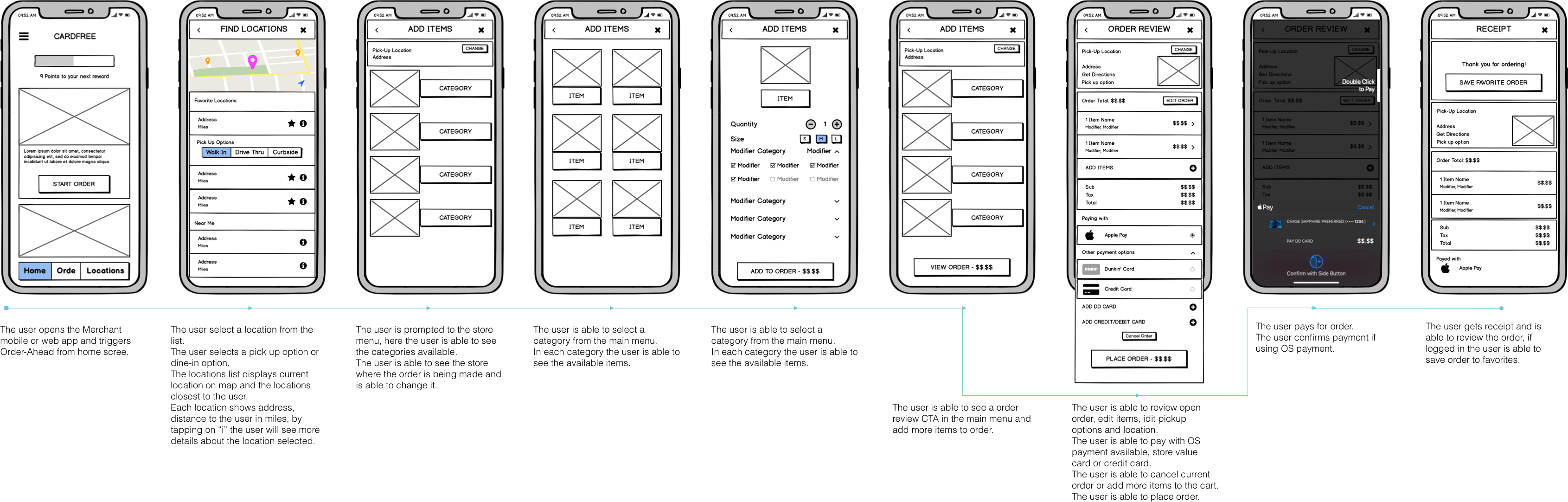
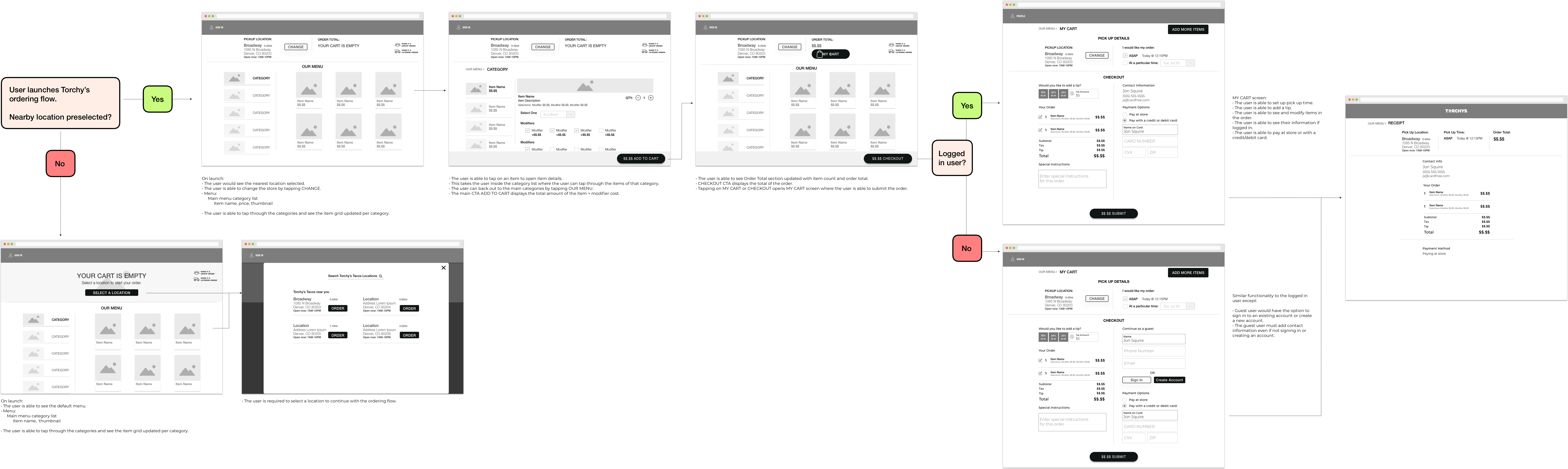
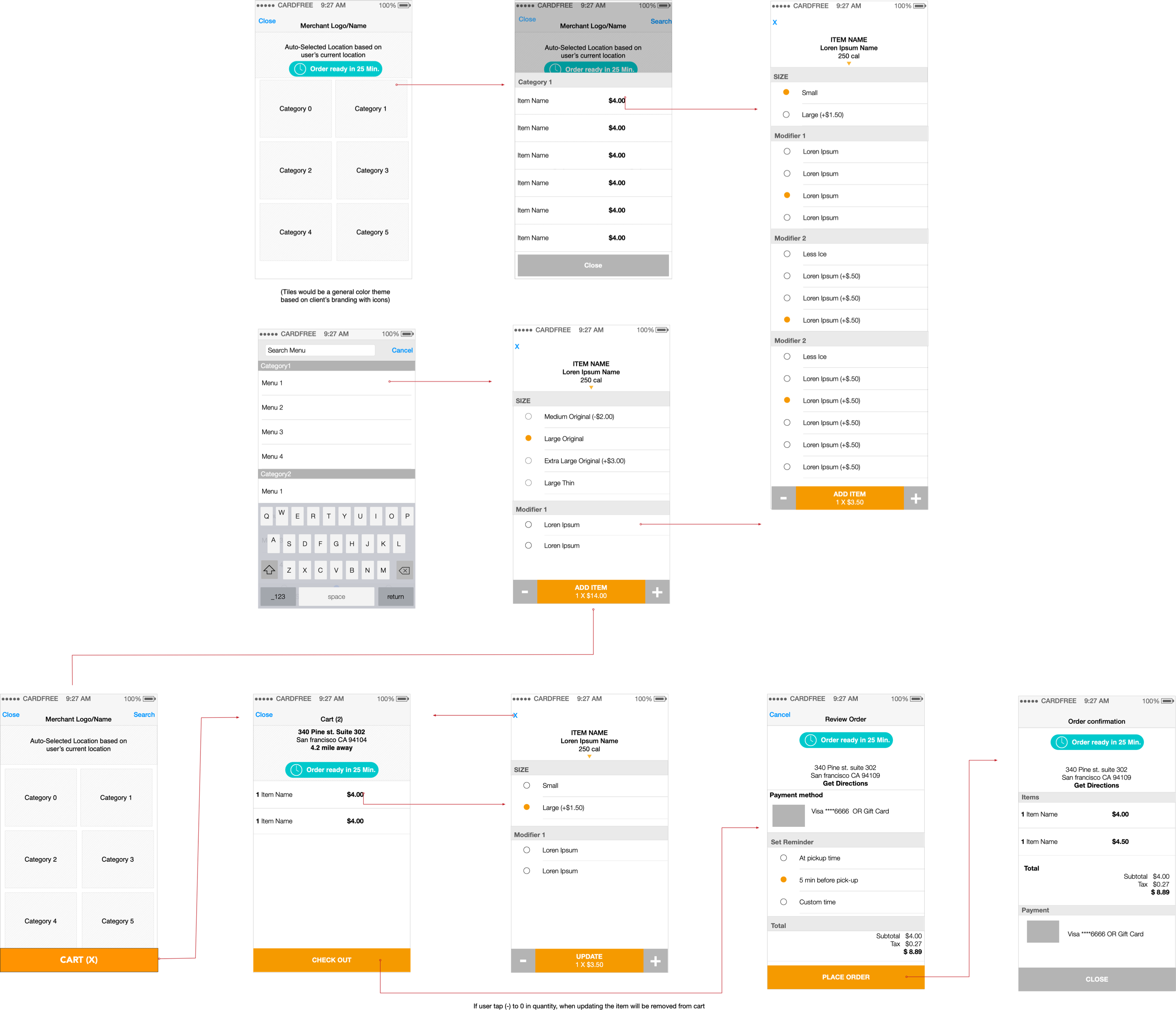
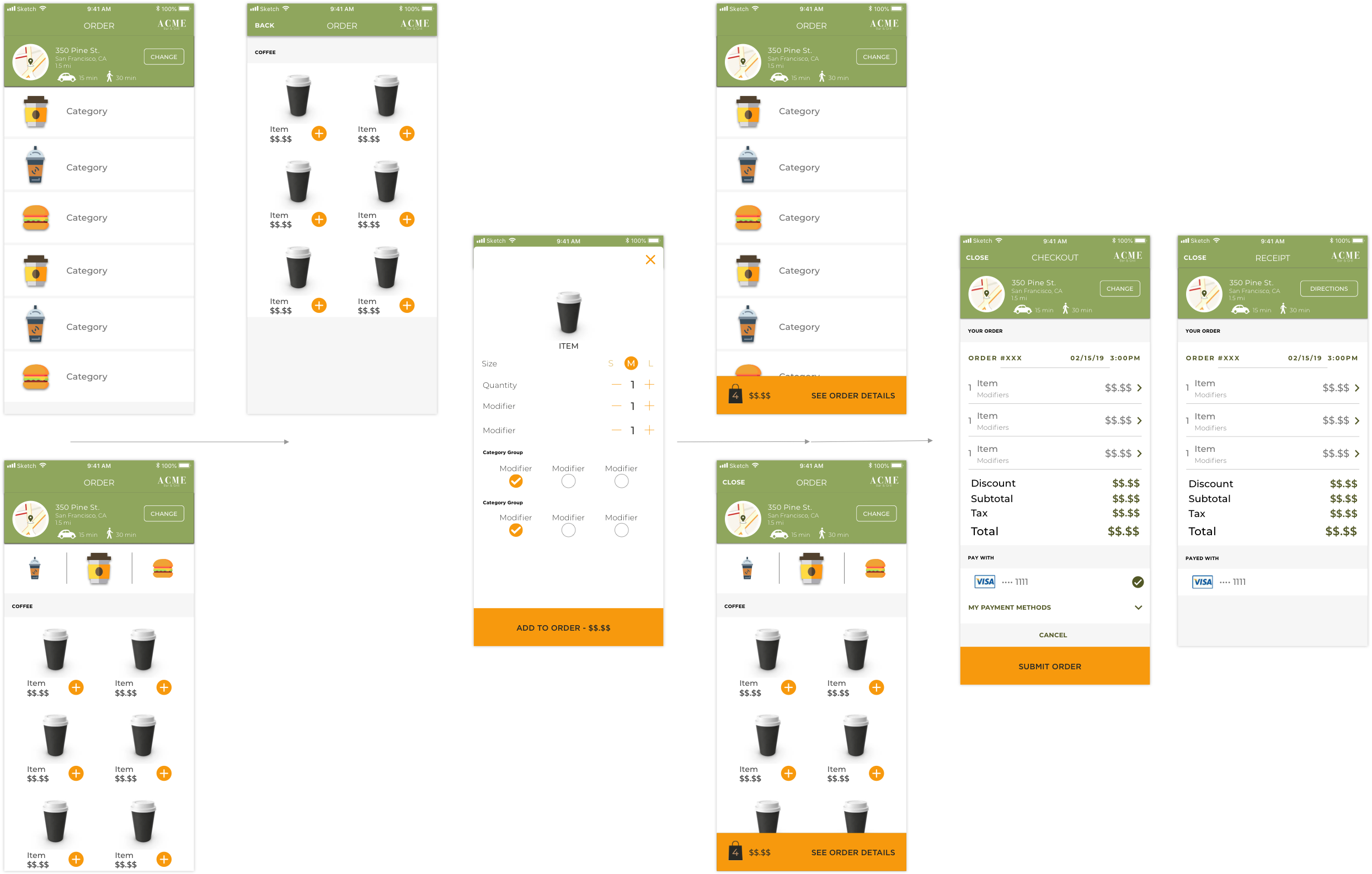
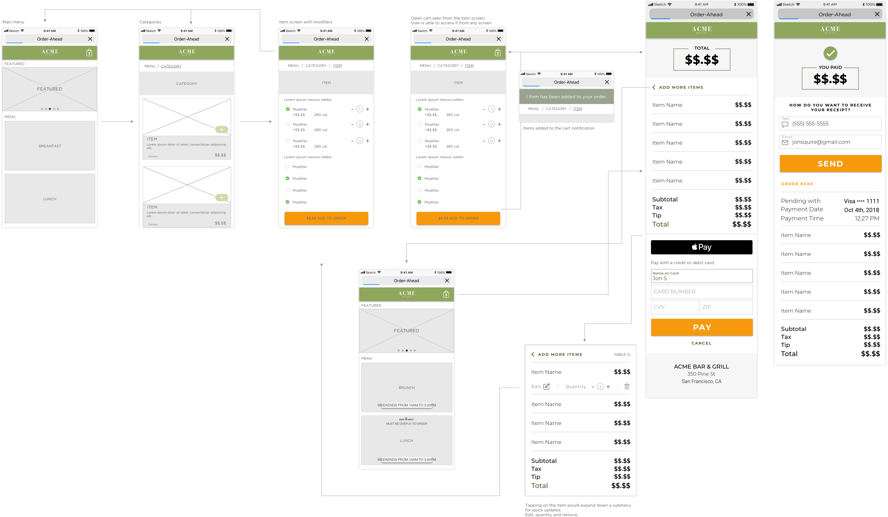
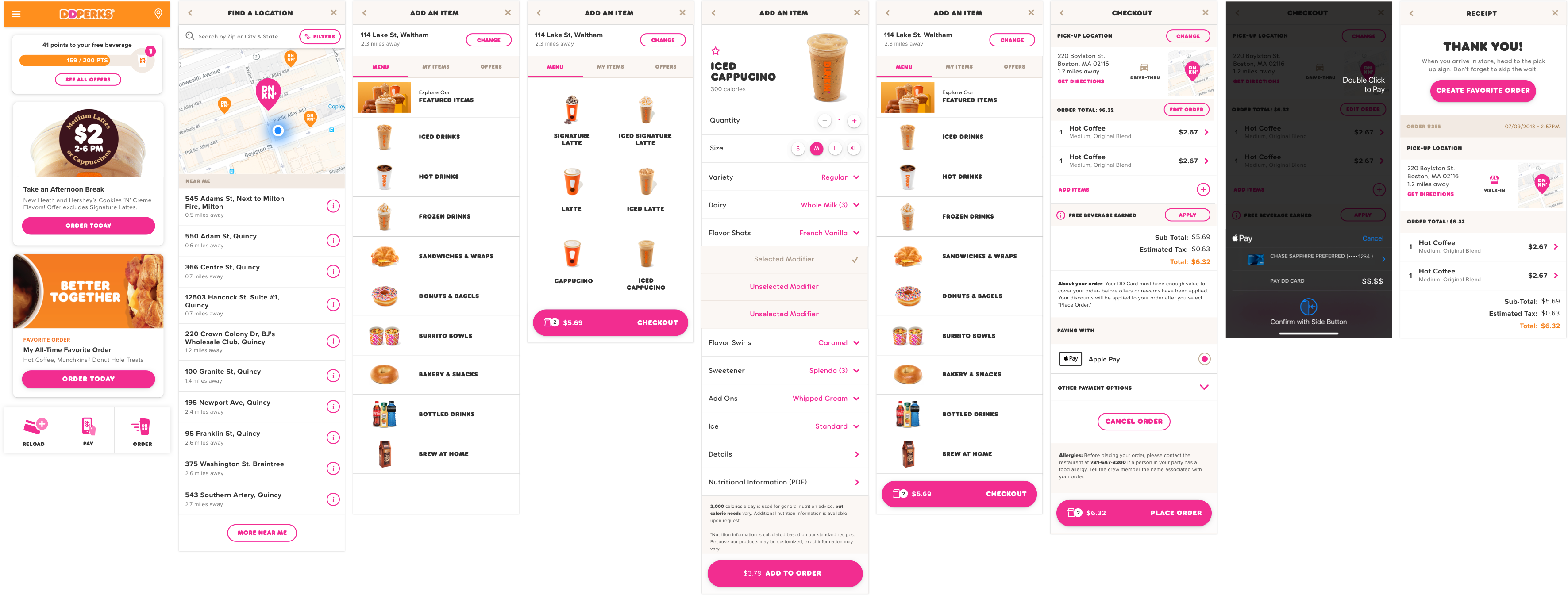
Outlined user flows with clear step by step interactions. e.g. Select a store from stores available around you to start your order, then start an order for that store.
Present to the user only the information needed to finalize the task at hand. e.g. Pick Up options: Pick one of Pick Up, Delivery, Order at Table.
Maximized screen real-estate displaying menu categories in parent level and items in children level within groups, grids, and independent of product photography. Display key product information, e.g. name, modifiers, price.
Utilize item independent modules to present the user modifiers and available edits to the item that require user’s input.
Clear checkout information with order details, pick up options, totals and the ability to add more items to cart or change pick up options are key.
Payment management with in its own module helps users not make mistakes in the payment process and keeps details the task for better UX.
Post ordering the user should be able to easily reorder or favorite a past order.
The base user for Order-Ahead is a broad rage of personas defined by demographic, location, economics, profession, life sircustances to name a few. Some statistics point out that:
While the approaches in UI and Visual Design vary from merchant to merchant, the key and core features and UX are universal in the Order-Ahead ecosystem.
Some key findings:
60 percent of U.S. consumers order delivery or takeout once a week.
31 percent say they use these third-party delivery services at least twice a week.
34 percent of consumers spend at least $50 per order when ordering food online.
20 percent of consumers say they spend more on off-premise orders compared to a regular dine-in experience.
Digital ordering and delivery has grown 300 percent faster than dine-in traffic since 2014.
70 percent of consumers say they’d rather order directly from a restaurant, preferring that their money goes straight to the restaurant and not a third party.
57 percent of millennials say that they have restaurant food delivered so they can watch movies and TV shows at home.
59 percent of restaurant orders from millennials are takeout or delivery.
To understant who are we designing for, we defined 2 personas in a high-level and standard set of needs:
1. User opens the app (app, web view, etc. Mobile/Web app calls our APIs / SDK).
2. Find nearest mobile order enabled store.
3. Select the store.
4. On the store homepage, the user is presented with time information ("Today at 8:18 AM" for example, or "Busy, prep time is longer than usual")
- User gets this information before they build an order.
- User gets pickup options.
- User gets order type options (Dine-In, delivery).
5. Browse a (master) menu or selects from their favorite order or order history.
6. Select a category (coffee).
7. View items in that category (espresso, latte, macchiato, etc.).
8. Select modifiers (double shot, almond milk, large, light sweetener, 2x sugar).
9. Add to cart.
11. Order is open and the user is able to review on Checkout.
12. View and edit pickup options or order type options.
13. View items on cart, the user is able to update items in cart.
14. The user is able to add more items to cart.
15. Select payment tender (stored value card, credit card, debit card, OS specific).
16. Purchase.
17. Immediately upon purchase, the user will receive informant in the UI (pop up modal, etc.) - Scheduled for pick up, date, time, instructions (go to pre order counter, etc.) and a dismiss button "OK" forcing the user to acknowledge the information.
18. Upon dismissing the order confirmation information the user is taken to a screen in the app that contains a map of the location, the estimated order time, the order status (order sent, preparing order, order ready for pick up) - note that the area of this screen that contains the order status is dynamic - it will update when the order status updates (from preparing order to order ready for pick up, etc.) .
19. The user can use navigation to leave this page and either build another order or explore the menu - for example a back arrow taking the user to the store home page.
20. The user will always be able to get back to the order dynamic order confirmation page (map, status, etc.) - if they are on the store home page or exploring the menu, there will be visual indicator to take them back to the dynamic order confirmation page (for example a cell that states Order History, etc.).
21. User goes to store and pick up the item or at restaurant.
22. Additionally, the user gets a receipt via push/email (product / item ordered including modifiers and subtotal, tax and total). There will be a prominent call to action on the receipt as well - Order Ready at 8:19 AM, Friday March 04 with instructions (please go to mobile order station, etc.).
When we started building the wireframe for Cardfree, the main client on the pipeline was Dunkin’. The current app is built on these wireframes for Order-Ahead, however, the project has expanded to support other clients.
While braking down the wireframes for the Order-Ahead flow I started outlining UI components that would be standard for all the merchant across the experience.
I designed the UI based on components from Google’s Material Design and iOS Design Guidelines.
With the overal Order-Ahead flow stablished I started the process of building the UI components.
In the process I designed two sets for the menu UX.
The menu list support images and category title.
The merchant is able to display only the category title if images are not available.
UX differs as the menu list only displays the item grid if the user selects an item.
The grid displays all times for the on focus category.
The user is able to swipe through categories.
The menu grid support images and category title.
The merchant is able to display only the category title if images are not available or only the images if no title available.
As part of the Order-Ahead experience I designed the web app following the patters stablished in the mobile experience.
For Dunkin’ I have redifine UI components to match with their global brand identity, the UX and core UI is based on the Order-Ahead framework. The framework is also used for Dunkin’s loyalty, payment, store value cards, locations, account manegment and more.